What is nwsmkr
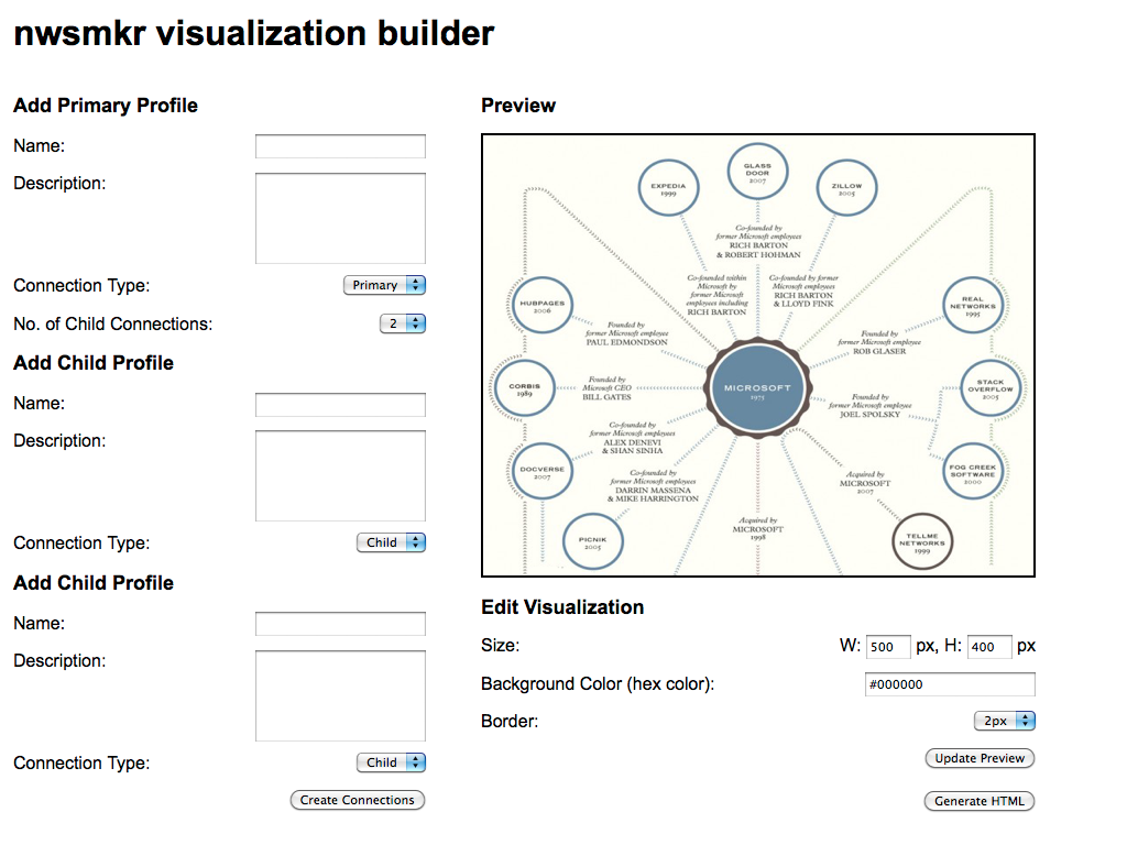
nwsmkr is an interface to an open-source javascript visualization library. It will generate embed codes for visualizations that show the connections between public figures. It will lower the bar for journalists interested in digital storytelling. It will offer an entry-point for journalists who want to learn to code.
The Pitch
The “Product”
In an age when consumers of digital news are clamoring for more information in more places, and beat reporters and journalists face constant deadlines, there needs to be an entry-level solution to quickly visualize facts and data.
That solution needs to:
Excite a journalist about digital news.
Be simple, open and extensible.
Be efficient while on deadline.
Provide opportunities to learn.
I think an interface to an open-source javascript visulalization library provides that multi-prong solution.

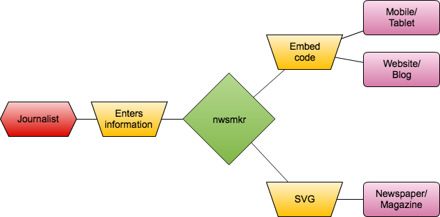
After a journalist enters information to visualize, the interface generates an embed code for a news organization’s website or a journalist’s blog. The interface can also generate a scaleable vector graphic for display in print products. And because the visualization is based on open-web standards — HTML5, CSS3 and javascript — it can be seen on mobile devices and tablets.

nwsmkr will focus on being an open-source option for visualizing connections and distinctions between public figures. It’s open-source and a snap to integrate into existing operations and workflow.
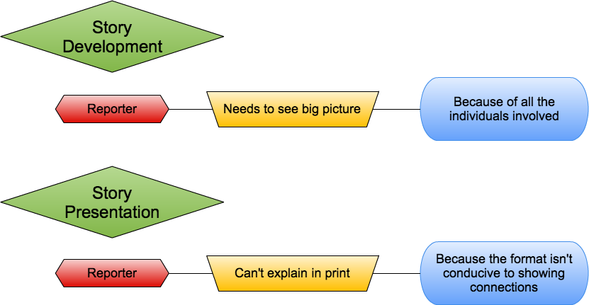
From the start, I see two specific use cases for nwsmkr in the newsroom. Again, because nwsmkr can evolve depending on needs, those use cases can grow.

The Proposal
Across the world newsrooms have been asked to “do more with less.”
As “hacks and hackers,” not only do we need to develop new ways of presenting the news, but we have a responsibility to bring our newsrooms more:
More efficiencies through technology.
More tools to flatten required skill sets.
More lessons on forming collaborative teams.
More insights into building a digital community.
nwsmkr is the least “sexy” proposal to come out of the Mozilla-Knight Learning Lab. But evaluating newsroom workflows and structures for efficiency and the ability to create value for the end user isn’t very sexy.
Simple, practical tools like nwsmkr are needed in the newsroom. Without basic workflow hacks, we miss out on the chance to teach others how to use them. We miss out on the chance to work side-by-side with a small group of people and try to change one small corner of the world — or the newsroom.
Put simply, we miss the chance to have more endings like the one I’ve imagined in this series of memos, which illustrate the potential of combining collaboration and simple newsroom tools more than I ever could.
TO: Newsroom
FROM: Managing Editor
RE: Layoffs
As you all know by now, we’ve been forced to make additional cuts to our staff. With the loss of several veteran staffers, I’ve decided that I can no longer ask you to do more with less. But I can ask you what you think we should be doing.
I don’t have all the answers, but as we carry out “acts of journalism” each day, ask yourself these questions:
Did I provide the user with more context and information about my beat than I did yesterday?
What have I learned about the subject since I began writing about it?
Is my work closer to becoming the definitive source of information on this subject?
Over the next week I’d like to hear suggestions on how we can start answering, “Yes” each and everyday. What should we should prioritize in terms of coverage and where we are spending too much time and effort?
Signed…
TO: Managing Editor
FROM: Online Editor
RE: Layoffs
You asked us to be on the lookout for new ways of telling stories for our readers, and I think I found one.
With nwsmkr we can create diagrams that show connections between people. The first thing I thought of was the news package Simmons put together about the kickbacks that Judge Baker received from the mayor’s daughter for steering social services clients to his courtroom. A diagram to go along with that would have been fantastic.
This site makes creating that kind of diagram really easy, and it can export a version that we can run in print as well. I checked with the design desk and they said they can place the graphic on a page.
If you want more information, let me know. I’m going to pass it along to our web developer as well.
TO: Online Editor
FROM: Web Developer
RE: nwsmkr
Hey – I ran through that site you sent over and we can go either route: use that interface or bring it to our server. I’m in favor of the latter because we might be able to combine it with some of the homebrew apps we created — like the wiki? — and also streamline how we get the graphics onto the website.
I’d also be interested if the newsroom has any special wants — a different layout for graphics that will go with crime stories vs. political stories…?
Let me know…
TO: Web Developer
FROM: Cops Reporter
RE: Database
You know that arrest database you created? Well we’ve been using this new graphics tool, and I was wondering if I could get a spreadsheet of that database. I’d like to go through and see what kind of connections might exist. You can just email it to me when you have time.
TO: Cops Reporter
FROM: City Editor
RE: Your Review
When your review time comes up, make sure you spend time explaining all you’ve been doing online. The arrest database has been fantastic, and I’ve heard from plenty of readers who have great things to say about the graphics you’ve come up with using that information. And the one last week showing the connections between the excise police and gaming vendors really brought the issue home to gambling regulators.
Keep up the good work…
The “Technical” Roadmap
Project Name: nwsmkr
Project Lead(s): Any and all of us who are interested in building a solid storytelling and visualization tool for newsrooms and journalists
Project Goal: Aside from having fun, getting to know each of you in person, helping each of you build and create and touring the city… To come away with a working web form that searches against the LittleSis.org API, and marries it with user input to generate a JIT javascript visualization and an embed code to display on a website.
OR
Pick the brains of every dev available to me, spend the week learning what skills I need to make this happen in the future and come away with a technical roadmap that I can follow so I can create this.
Milestones to reach project goal:
Create web form that allows for dynamic options and submission of variables
How many primary connections
Size of visual
Title of visual
Explainer text of visual
Search LittleSis.org API for potential variables*
Structure query request of LittleSis.org database
Return results to user with options to select profiles for inclusion into visualization
Leave place for hooks that will allows writing of data to LittleSis.org database
Write a JSON data data structure*
Data structure will contain variables for the user and LittleSis.org data.
Data structure will be added to the JIT javascript library
Needs:
I’d love to have someone with Python/django/sql skills and familiar with pulling APIs into a JSON structure.
At this point I’m not focusing on how the user interface would look, so there is an opportunity there for a designer or HTML/CSS lead.
I’d love to recruit a journalist or two to lead the storytelling effort, and — to paraphrase Jordan — make sure the content sings whether it’s a series of stories or simple labels and annotations that lead the user to the most important aspects.
Additional information:
Data Source
Thanks to members of #hacktoberfest I have been able to chat with Kevin Connor and Matthew Skomarovsky who co-created LittleSis.org, which bills itself as “An involuntary facebook of powerful Americans, collaboratively edited and maintained by people like you…”
Techically speaking, LittleSis.org is a relational wiki database designed to track information on powerful people, organizations, and networks — more than 80,000 of them — that has strict sourcing requirements, a strong permissions system, and full modification tracking that guard against editorial abuse, help users find original sources, and make the editing process transparent.
The LittleSis API makes it easy to retrieve data entered into the system for display on other sites, and a bookmarklet allows selected user to add information to the database directly from a news story.
Best of all, LittleSis is free and open-source.
Visualization Library
The JavaScript InfoVis Toolkit provides tools for creating Interactive Data Visualizations for the Web.
Background Posts:
The thinking that went into this project/idea is here.
Link for more info:
#moznewslab final presentation is here.
Link for demo:
Coming soon…
Source code:
GitHub Repo is here.