Walkthrough - Using FusionTables to power Highcharts column chart
Published 2011-11-26
Updated to reflect coding help and suggestions from Kevin Schaul and Slawek Kolodziej that fixed an issue with the chart appending data to existing data. Thanks Kevin and Slawek!
Since the spring, Wisconsin State Journal multimedia and graphics gurus Jason Klein and Laura Sparks started to use the Highcharts javascript library to produce data visuals that could be used in print, on the web and on tablets.
Right about the same time, over at madison.com, I started to learn how Google Fusion Tables and its SQL API could function as an easy to use data backend, and in conjunction with the Maps API, layer data on top of shapes.
With this walkthrough, I am assuming you have created a Fusion Table, mapped it and merged it with shapefiles. If you haven’t, you can head to Google and search for Fusion Tables & tutorials. You will find plenty of options.
And I’ve gathered several tutorials on the use of Fusion Tables as well that will cover the basics.
Last week Jason had a need to combine the three elements -- Fusion Tables, Maps and Highcharts -- but not necessarily the time -- in putting together a map and chart showing Wisconsin farm subsidies that are paid to city residents.
Without time to make it happen on deadline, I was able to run through an exercise to combine the three into one display -- and aside from one minor issue -- make it work fairly well.
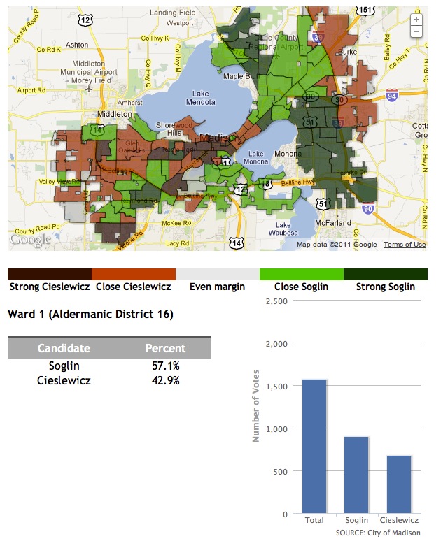
In this particular use case, my map would display information from the 2011 Madison mayoral election based on the city's wards. When a user clicked on a ward, the map would display the corresponding data in a table and in a column chart.
Because I haven’t done a proper walkthrough on weaving this together, here’s an attempt… If you have more javascript experience than me — which you likely do — please feel free to drop hints or suggestions. Especially since I have no idea if any of this is “correct” or “efficient.” But it does work, so that should count for something.
First I put together some variables that can be used throughout the script.
Chart and map are self-explanatory. Series is a variable for the data that the column chart will display. optionsChart represents the myriad of options that Highcharts allows for customizing its visualizations.
var chart;
var map;
var series;
var optionsChart;
These are part of the options for the column chart. I found it easier to set this here.
var minChart = 0;
var maxChart = 2100;
These will stand for data pulled from the Fusion Table.
var ward;
var votesSoglin;
var votesCieslewicz;
var votesTotal;
We will then start our jQuery function.
$(document).ready(function(){
    //code to execute here
});
From the Highcharts documentation:
“Highcharts uses a JavaScript object structure to define the options. The options are nested into categories. The options are mainly strings and numbers, but some are arrays, other objects or even functions. When you initialize the chart using new Highcharts.Chart, the options object is the first parameter you pass.”
Within the options, you set the type of visualization — there are a lot — the div you want to write the visualization to, set the fonts, colors, titles, formatting the tool tip and much more.
Taking a cue from a Highcharts walkthrough on pulling data from a csv, I set the Highcharts options to a variable.
var optionsChart = {

    chart: {
        renderTo: 'hc-ouput',
        defaultSeriesType: 'column',
        marginBottom: 35,
    },

    title: {
        style: {
            color: '#000000',
        },
        align: 'left',
        text: '',
    },
    subtitle: {
        style: {
            color: '#000000',
        },
        y: 37,
        align: 'left',
    },
    xAxis: {
        categories: [
            'Total',
            'Soglin',
            'Cieslewicz',
        ]
    },

    yAxis: {
        min: minChart,
        max: maxChart,
        title: {
            text: 'Number of Votes',
            style: {
                color: '#999999',
            }
        }
    },

    legend: {
        itemStyle: {},
        layout: 'vertical',
        backgroundColor: '#FFFFFF',
        align: 'left',
        verticalAlign: 'top',
        x: 1000000,
        y: 70,
        floating: true,
        shadow: true
    },

    tooltip: {
        style: {},

        formatter: function () {
            return '' + this.point.name + ':' + '<b>' + this.y + ' votes';
        }
    },

    plotOptions: {
        column: {
            pointPadding: 0.025,
            borderWidth: 0
        }
    },

    credits: {
        style: {
            color: '#666666',
        },

        text: 'SOURCE: City of Madison',
        href: 'http://www.cityofmadison.com/',
        position: {
            align: 'right',
            y: -3
        }
    },

    series: []

};
And options for the map follow.
var optionsMap = {
    zoom: 11,
    center: new google.maps.LatLng(43.083433,-89.403305),
    mapTypeId: google.maps.MapTypeId.ROADMAP,
    scrollwheel: false,
    disableDragging: true,
    mapTypeControl: false,
    navigationControl: true,
    streetViewControl: false,
    scaleControl: false,
    navigationControlOptions: {
        style: google.maps.NavigationControlStyle.SMALL,
        position: google.maps.ControlPosition.RIGHT_TOP
    }
};
From there I write the map to the div I have set up — in this case map_canvas — and add the options.
var map = new google.maps.Map(document.getElementById('map_canvas'), optionsMap);Then I grab the a layer from Fusion Tables — 835334 is the ID of the table — turn off the info windows, and set it to the map.
layer = new google.maps.FusionTablesLayer(835224, {suppressInfoWindows: true});
layer.setMap(map);
Now, I want to be to show user data based on the area of the map they clicked on. In this cases it’s votes for candidates in a particular ward. So to do this I need to add a click event, and I add the click event on the layer I set one line above. That data is the result of two tables being merged: one with voting data that is matched to one with geographic shapes based on a key column.
google.maps.event.addListener(layer, 'click', function(q) {
    //code to execute here
});
When a user clicks on a particular area I can return the specific data. This is pretty much the same you configure an info window within the Fusion Tables interface.
A construct like this — q.row[‘Ward_name’].value — gives me access to the data in the column with the title of Ward_name.
So I’ll just use the jQuery .html() function to write data from a given column and row to a div.
Then we will call the function to write the chart.
updateChart(q);
Per some advice from Kevin Schaul, we moved the "chart-writing" part of the code to it's own function.
To grab the data, we'll reach back to some variables from the beginning and assign data from the Fusion Table to them.
var ward = q.row['Ward_name'].value
var votesSoglin = q.row['Votes_Paul_Soglin'].value
var votesCieslewicz = q.row['Votes_Dave_Cieslewicz'].value
var votesTotal = q.row['Total_ward_votes'].value
Those variables will then be added to the empty series referenced in the chart options. The new series is then pushed to the chart options.
var series = {
            data: [
                ['Ward ' + ward, votesTotal],
                ['Ward ' + ward, votesSoglin],
                ['Ward ' + ward, votesCieslewicz],
            ]
        };

optionsChart.series.push(series);
And like I did with the map, I will write the column chart to a div, and adding my options
var chart = new Highcharts.Chart(optionsChart);
But when a user clicked on the map, the script would push the data series to the options object. Click on the map, and more data is pushed. Click, push, etc. Pretty quickly, the one column bar column would have 2, 3, 4, 5 columns.
And here's where Mr. Schaul turned me on to something that I didn't know I didn't know and provided a key update to the code: pop().
Just as the push() method "adds new elements to the end of an array, and returns the new length," the pop() method "removes the last element of an array, and returns that element."
So adding...
optionsChart.series.pop();
...prior to the...
optionsChart.series.push(series);
...ensures that only data from the clicked area will be written to the chart.
Here's the entire updateChart(q) function:
//writes chart
function updateChart(q){

    //assign data to chart variables
        var ward = q.row['Ward_name'].value
        var votesSoglin = q.row['Votes_Paul_Soglin'].value
        var votesCieslewicz = q.row['Votes_Dave_Cieslewicz'].value
        var votesTotal = q.row['Total_ward_votes'].value

        //write chart series
        var series = {
                data: [
                        ['Ward ' + ward, votesTotal],
                        ['Ward ' + ward, votesSoglin],
                        ['Ward ' + ward, votesCieslewicz],
                ]
        };

        // Pop the old data out of the chart
        optionsChart.series.pop();

        //push the chart series to the chart options
        optionsChart.series.push(series);

        //write the chart
        var chart = new Highcharts.Chart(optionsChart);
}