@storify updates looks, but most important, adds powerful new features to streamline curation and creation experience
Published 2011-10-27

There’s a new logo and new look for Storify, but that’s hardly the end of the … ah … story.
No, one of the best tools for curating news and conversations taking place on the web received an elegant makeover courtesy of Burt Herman, Xavier Damman -- and many others -- and added tools that will make the process of creating much more streamlined and efficient.
Among the new features:
-
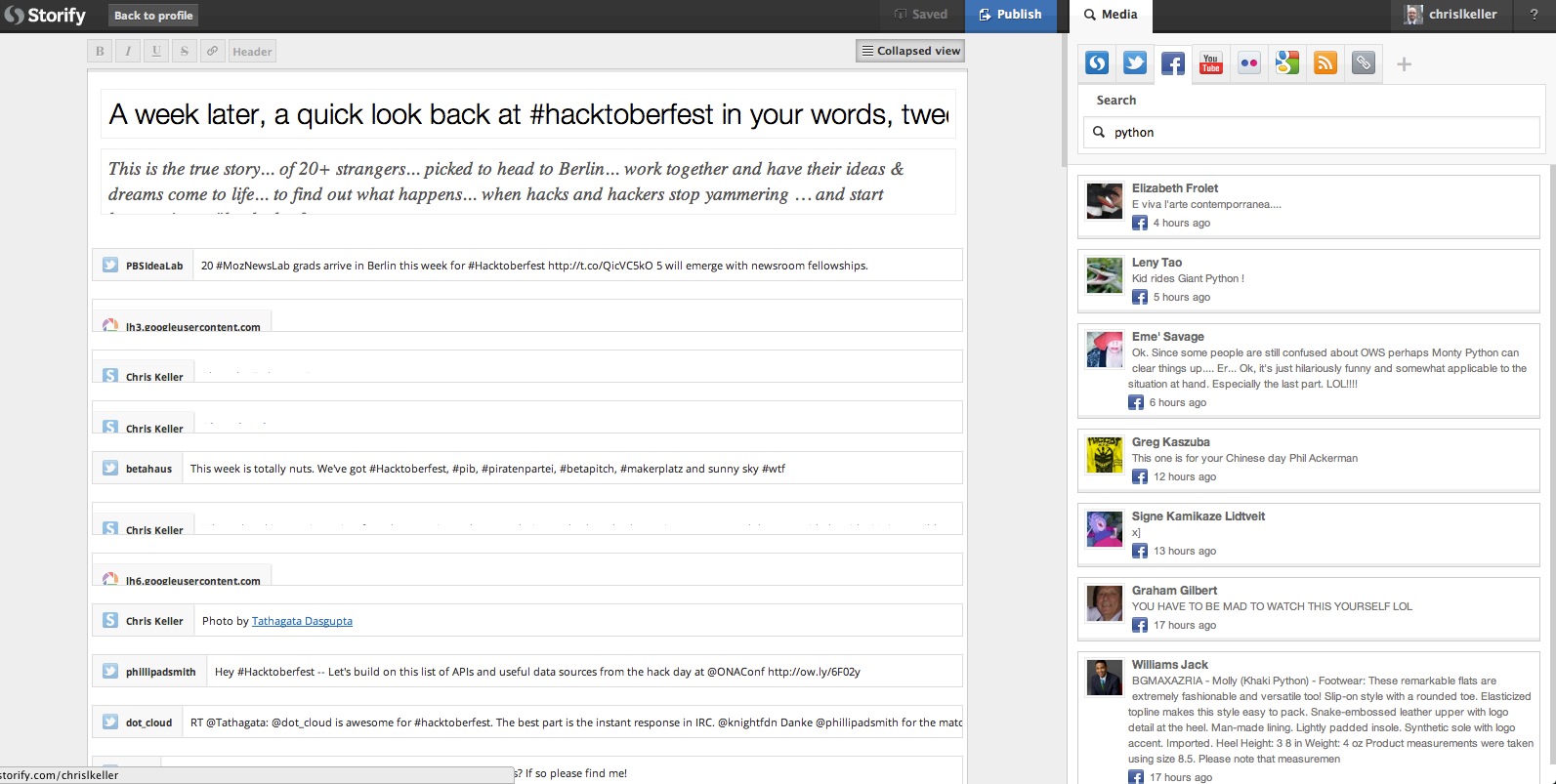
There’s the new ability to collapse your timeline, which makes curating and editing longer pieces so much easier than before. While I can drag and drop elements while in this view, it appears I can’t edited text boxes while in collapsed mode.
-
The above feature is combined with a streamlined drag-and-drop functionality that just makes building the story seem more fluid that then previous version.
-
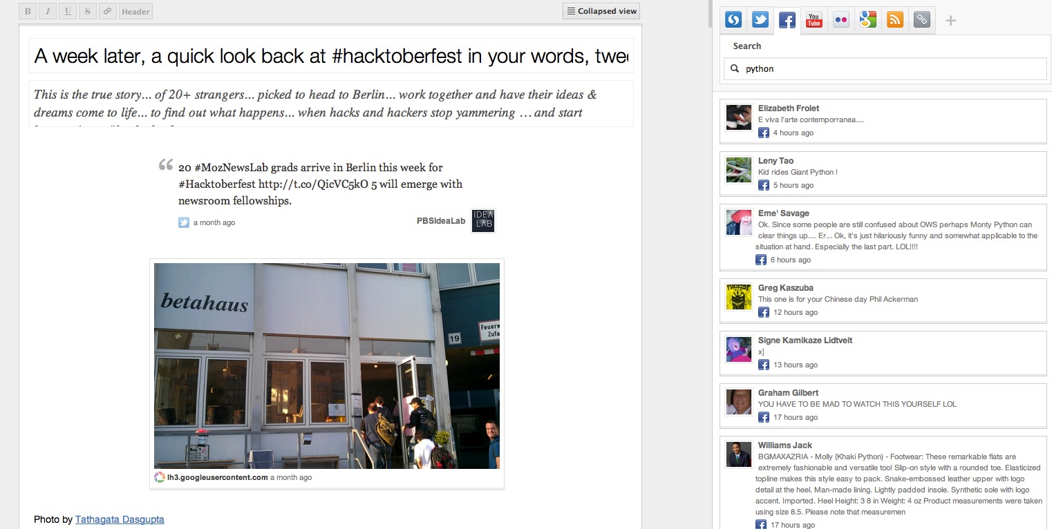
The search and the editor panes have changed sides, so now you create on the left-hand side, and search on the right-hand side and drag left.
-
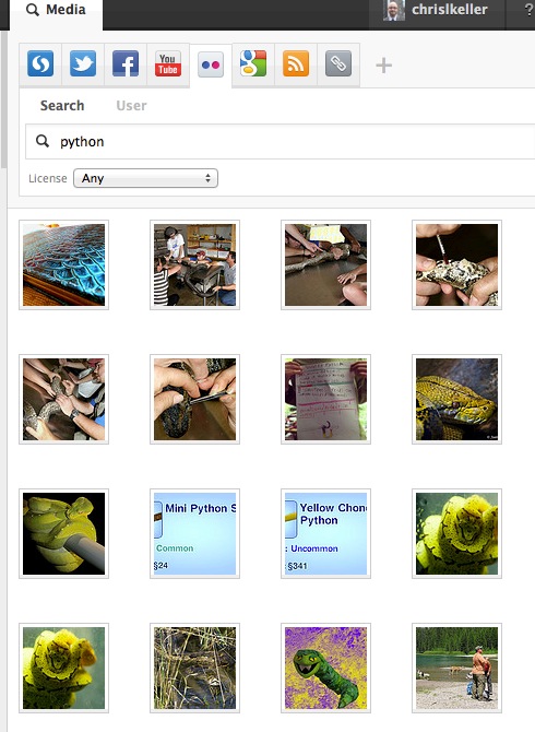
It feels as though search terms now persist as you move through the social channels. For instance, searching for remains the active term as I move from Twitter, through Facebook and Flickr.
-
Results of photo searches have a new “gallery format” display,“ while images themselves appear larger.
-
An autosave function kicks in shortly after any changes to your story are made.


Storify also mentions a revised Storypad bookmarklet which gives you more power to curate and gather information from all over the internet and add to your stories, but as someone who can’t find their bookmarklet — or how to reinstall it — I can’t comment on that feature. I also notice that the Chrome extension isn’t working quite right for me, but that’s hardly indicative of anything. Many things don’t work right for me.
What does sound awesome is the fact that the Storypad can be shared with other users, which suddenly makes it a wicked tool for collaboration.
I have to say, the updates and added features really do a lot to streamline the experience, and I’m left with only one known wish which is the ability to multi-select, group or “chain” multiple elements together during the editing process. But that need only arises in longer pieces, and the collapsed view does enough to mitigate it for now.
I also would like the ability to select editors on the story-level basis, as opposed to global editing ability.
If you’re new to Storify, you can find plenty of tips and tutorials from around the web. Here are a couple.