New tool to visualize Fusion Tables data: the "Chart Wizard"
Published 2012-03-25
Tucked away in a slide deck from a presentation by Google’s Kathryn Hurley and the Guardian’s Simon Rogers at the Guardian Open Weekend on data journalism was a link to a Fusion Tables Chart Wizard.
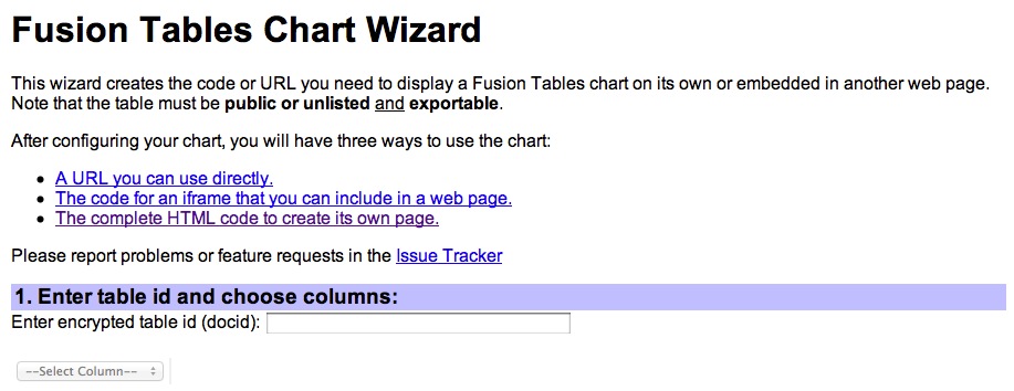
Much like the Fusion Tables Layer Wizard, the chart wizard will take information stored in the service and create the code needed to visualize it – in this case in the form of a chart.
I'm not sure how long this tool has been available, but it appears to me to be new... I have several things in the queue before I can make the time to play with or create anything with it, hence now walkthrough. But if you do, please take the time to write up a bit on how you made your creation and send out a link for others to see.
Here's an embed from the presentation, and don't miss the great ideas and resources being offered by the Guardian during its Open Weekend.