Google's Fusion Tables gets new features, UI makeover & streamlined experience
Published 2012-03-29
I had the chance to meet, talk to and thank Google's Rebecca Shapley last month at #nicar12 in St. Louis. Rebecca is the product manager for Fusion Tables, a tool, platform and playground that I've used quite extensively over the last year to make maps, store information, and most of all experiment with.
Rebecca mentioned that Fusion Tables was due to get some new features in the coming months and my curiosity was piqued. Well, the new features are here ... along with a streamlined user interface ... and a smoother user experience.
All in all, some of the new features in it's Experimental UI mark a graduation of sorts for Fusion Tables.
Here’s what I’ve found thus far:


-
Billed as “Faceted filter creation,” there’s a streamlined data filtering feature that is Google Refine-esque compared to the Classic Fusion Tables filter. While lacking the same power as Refine – I can’t change each instance of a misspelled word from the filter – it’s more friendly to the user who is looking to analyze data that has been cleaned and pruned. From an engineering standpoint, it probably brings the two products closer together…?
-
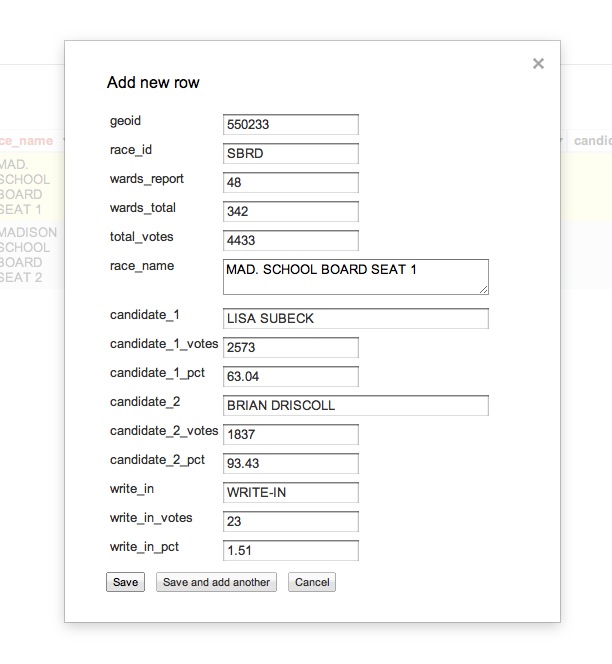
You can now duplicate rows in a table – or create new rows – by using a nice interface.
-
I can edit a row using the same feature. I don’t know about you, but editing cells in a row was always an adventure. This is straight forward, easy and slick.
-
You can modify the column information straight from the interface, including changing the Name, Type and Format.
-
The option to share a table is straight out of the Google Docs interface, with the option to share a link via Google+, Gmail, Facebook and Twitter.
-
Creating a view has a new, cleaner interface.
-
The user now has tabs across the top of the interface. For instance, in this table I can switch between my data, a card-based view – more on that – and my map much faster than before. I also have the option to add more tabs: a new row layout, card layout, summary, chart or map.
-
What is summary you ask? Well you now have the ability to perform some calculations on your data and graph it. I’ll need more time to play around with this angle, but if you do, let me know and I’ll link yo your write-up.
-
And the card view? You can see index-card views of your data – only the first 10 columns for me right now – that allows you quickly page through. This view can also be filtered.
-
Of course mapping is why a lot of folks come to use Fusion Tables, and some of the styling controls have been moved into a drop-down menu, including the ability to change the map styles, change the info window configuration and generate the iframe embed code.
-
There’s a making maps tutorial that caters to the experimental interface.
What’s missing?
According to the announcement, there are some features from the Classic UI that are not yet available in the Experimental UI. They are:
- Experimental visualizations
- Comments on rows, cells, or columns
- Selecting a subset of columns when merging tables
- Adding or deleting columns
- Customizing or embedding a chart created from the result of an aggregation
In addition, I thought given the popularity of the Fusion Tables Layer Wizard we might have seen some aspect of that tool earn its way into the UI. But it is only a click away to use. And that would go for the Fusion Tables Chart Wizard or the Styled Maps Wizard as well.
And syncing between Google Spreadsheets and Fusion Tables is a popular request, however there is a script for that.
I’ve surely missed a bunch, so if anything sticks out, let me know in the comments and I’ll add as soon as I can.
Resources: