nwsmkr - Visualizing the connections between the people the news is about
Published 2011-07-23
A “six degrees of separation” database, nwsmkr will combine a journalist’s curated notes with public contributions & social APIs to visualize connections and distinctions between public figures, providing a new storytelling method for news organizations.
Before I head to Best Buy to look at consumer technology I thought I'd share some thoughts on news technology, as it relates to the Mozilla-Knight Journalism Learning Lab and a "DRY" Approach to News.
I've spent the last week considering my original idea -- a curated topic page on steroids -- and talked with some colleagues in the news industry, thought about how to make unique desktop and mobile experiences for the user and considered how information might flow, all with the hopes of find a singular problem that can be solved -- a minimum viable product if you will.
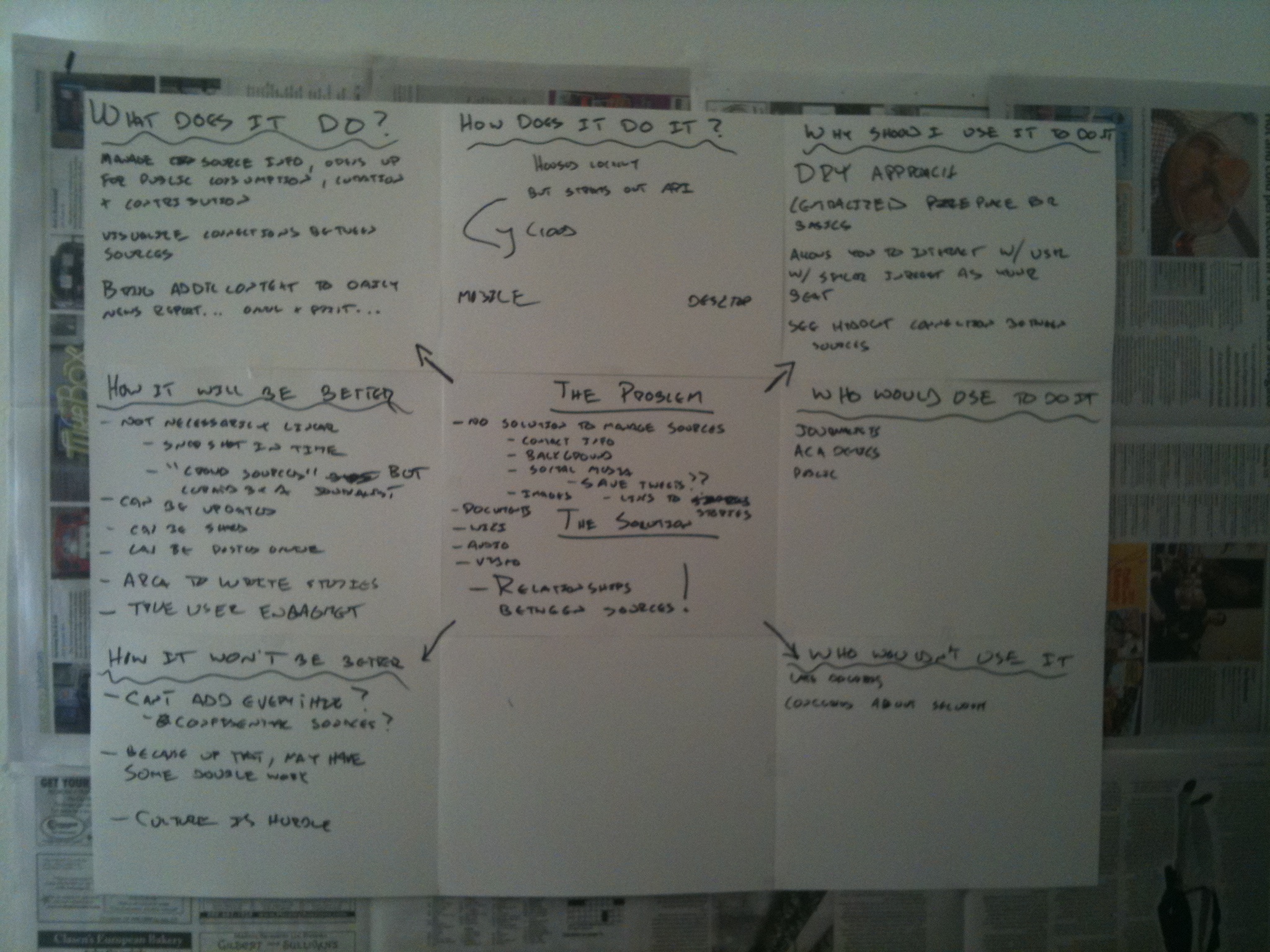
So when I hit submit on Aug. 5, I will be pitching nwsmkr as a way to visualize connections between the people that news is about.
Think of it as open-source Muckety, crossed with Storify and aspects of Wikipedia, Quora and Google's Living Stories with some gaming and social media mechanics thrown in.
The elevator pitch?
A “six degrees of separation” database, nwsmkr will combine a journalist’s curated notes with public contributions, social APIs to visualize connections and distinctions between public figures, providing a new storytelling method for news organizations.
The bullet points?
A “six degrees of separation” source database for journalists, nwsmkr will:
- Visualize connections and distinctions between public figures for journalists and the public, and provide a new storytelling method for the public and journalists.
- Combine a journalist’s selected & curated notes with public and social APIs to publish profiles of public figure, including images, videos, links, tweets, documents and background context from the social web.
- Further open the news gathering process to the public, who will be rewarded through gaming mechanics for their suggestions to enhance the public figure profile with credible information, or for pitching ideas for new profiles.
- Offer an API that will allow other news organizations to create or pull selected profiles into their content.
Do we need a way to visual connections between pubic figures? Well, if you're like Lester Freamon or me, you know what it means to be able to step back and see potential avenues for connections.
So today I dug up some old notes and found a couple attempts I made at drawing connections between people... It wasn't pretty at all. I used bullet lists and tried bolding names, but it wasn't beneficial. Now, if I were to try to do that I might use Evernote or something similar, but I still wouldn't be able to visualize it.
So using an online mockup tool I started drawing arrows. On this version, the names have been adjusted using a name randomizer for 99.9 percent obscurity. And to be safe the circumstances outlined have been altered and altered again to be on the safe side. But seeing things this way... Well it tells a story in a way that words can't.
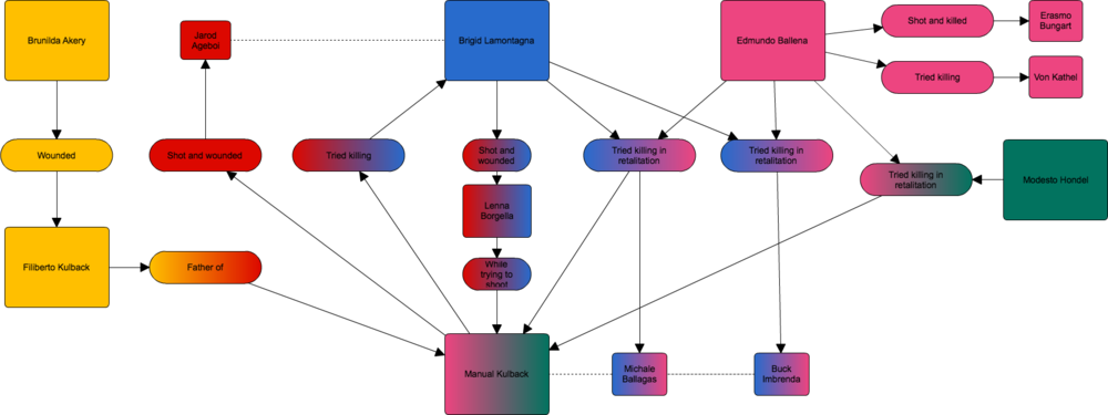
On the original, I found two or three things that I didn't notice before. Imagine what others might find?
So I'm going to go down this path for the final two weeks and see where it gets me. I believe nwsmkr fits in with my want for a DRY approached to gathering the news, offers an opportunity for the public to be involved in the process -- as long as they don't treat this like story comments -- and remains true to the need for bringing added depth, context and credibility to the news through authoritative voices, primary sources, professional reporting and user tips.
I hope others do too.